Dudus Media
Turning abstract brand language into a visual identity built on focus and depth.
00
problem
Dudus Media's brand positioning leaned on language every premium photography studio reaches for: "excellence," "phenomenal," "depth meets vision." The words were strong, but visually generic. The studio needed an identity that made that language feel specific and true, not interchangeable with any other studio's about page.
solution
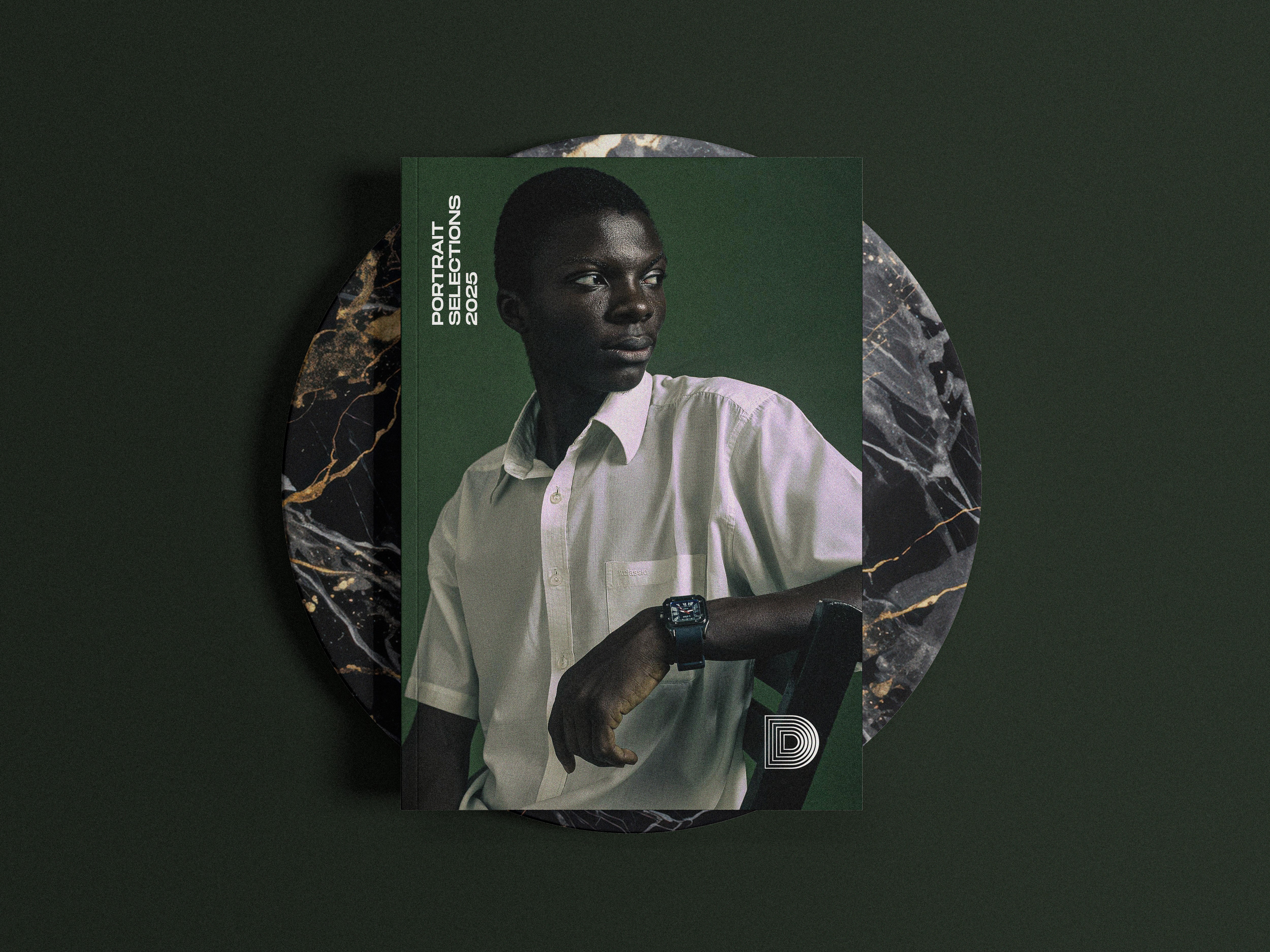
Solution I designed a mark built from four nested outlines of the letter "D," scaling inward toward a single point , echoing the aperture blades and pull of a camera viewfinder. It doesn't illustrate photography with a camera icon; it behaves like one, turning "depth meets vision" into an optical effect rather than a slogan. Paired with an antique gold palette instead of the cooler tones common in the space, the mark reads premium and artisanal rather than purely commercial. I led concept and execution, and built out a full identity guide: logo construction, clear space, acceptable/unacceptable usage, color variations, typography, and application rules, so the system could be applied consistently by anyone working with the brand going forward. Link: dudusmedia.mypixieset.com
year
2023
timeframe
2 months
tools
Adobe Suite
category
Positioning
01

02

03

see also


